JR chronicles:
The JR Chronicles was a exhebition on that as a class we went too. It was at the Saatchi gallery in London. There was a range of JR's work including his early work in Paris, and many that he has done around the world, When going to the gallery I took some photos and got lots of inspiration from his work.
|
|
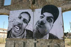
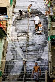
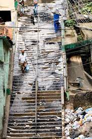
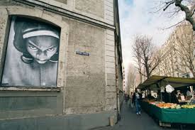
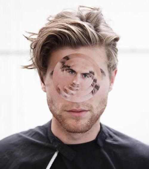
Here are some example of JR's work, he is a French photographer who originally started his journey by spray painting around Paris where he grew up.
Currently, his most common method to create street art is through the use of wheat pasting and gigantic mono photographs. He often gets his subject models faces with a 28mm wide-angle lens which result in portraits that unguarded, funny, soulful, real, and that capture the spirits of individuals who normally go unseen. JR often talked about how art can transport out experience beyond space and time.
Currently, his most common method to create street art is through the use of wheat pasting and gigantic mono photographs. He often gets his subject models faces with a 28mm wide-angle lens which result in portraits that unguarded, funny, soulful, real, and that capture the spirits of individuals who normally go unseen. JR often talked about how art can transport out experience beyond space and time.
before:
|
after:
|
The photos above is an example of a piece of work he did. JR often talks about how he doesn't mind the ripping and tarnishing of his work because it shoes the piece of art moulding to the world around it which is what all of his art is about; really capturing the things around him and not just people seeing what they want to see or what they have heard on the media! He wants to have a raw and unedited version of the world around everyone shown through is photography and art work
Here are some of the photographs I took at the exhibition:
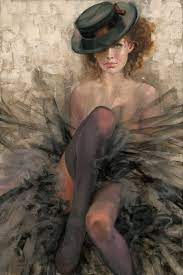
Portraits of a generation:
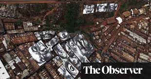
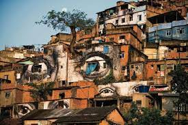
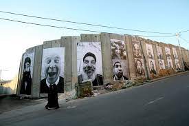
My response was inspired but Jr's strain of work called portraits of a generation, which was enlarged photos of ordinary people stuck up in places people would imagine. Sometimes these people were rivals such as people from opposing countries such as Israel and Palestine! He wanted to emphasise that all people are the same, and we are not as different as we think. He wanted to raise awareness for women's rights and countries in poverty. Although what was different about Jr was that he didn't want to base his work on what he saw on the media, but he wanted to try and experience first hand what other people experience.
|
|
|

|

|
(If you click on either of these images above you will be directed to two websites, giving your more information about both JR and this strand of work.)
www: good lighting and face on angles. The photograph transitioned well into my rasterbated image.
(The picture on the right was pixilated on rastorbator)
Gordan Magnin:
|

|
|
Gordon Magnin was born in Nevada, USA and lives and works in Southern California. Creating collages using appropriated photographic images, Gordon challenges the intended “intended objective, interpretation, and significance” of our daily diet of celebrity, advertising, and consumer based images. He creates interesting and unique photographs by cutting and pasting images of the persons face on top of one another.
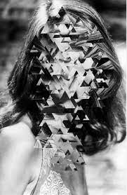
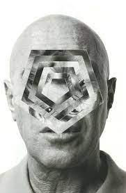
Geometric Portraits : (Digital)
My responses: |
|
|

|
|
|
www: good editing of the photo, and good variety of different shapes. aswell as this the GIF gives a better idea of the process.
Geometric Portraits: (Physical)
|
Alma Haser:
Born in 1989 into an artistic family in the Black Forest, Germany, Alma Haser is now based in London and on the southeast coast. She is known for her complex and meticulously constructed portraiture, which are influenced by her creativity and her background in fine art. Alma takes her photographs further by using a unique paper-folding method, collage and mixed media to create layers of intrigue around her models. |
|
My response:
To do this response I had chosen a photo of a women and made it into a geometric shape. I then stuck it onto the same flat photograph in different positions to make distorted face shapes. I took the photographs in many different angles to show a variety of features of her face facing each other to create a interesting and unique response.


2nd round of photos:

www: good positioning of object and good lighting.
ebi: better building of the geometric shape.
ebi: better building of the geometric shape.
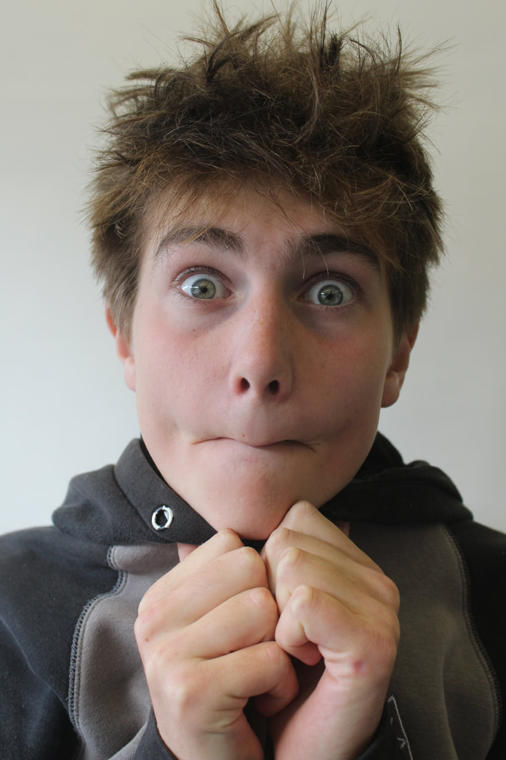
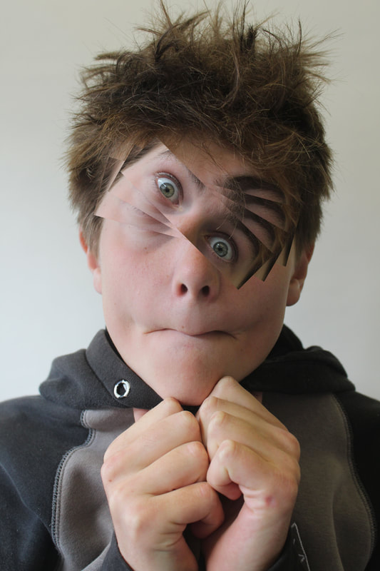
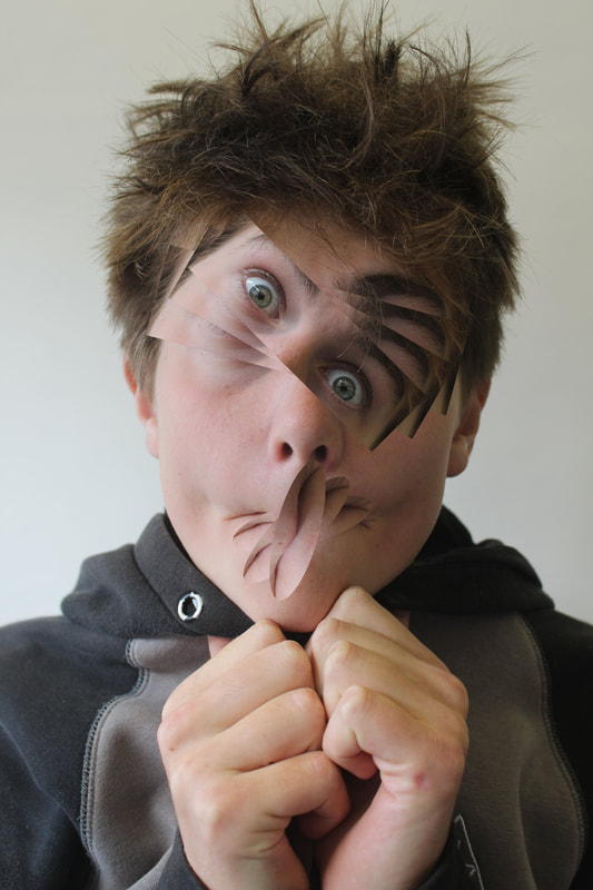
David Samuel:

|

|

|
My response:

To do this response i got two photos of myself and weaved them through each other. Although the idea and principle of this response id a good one, it didn't quite come out how i wanted.
If i'Il were to do it again i would probably cut the eave strips smaller to created a more precise and interesting effect. As well as this while weaving i would've made the line straighter to create a more finished and tidy look.
If i'Il were to do it again i would probably cut the eave strips smaller to created a more precise and interesting effect. As well as this while weaving i would've made the line straighter to create a more finished and tidy look.
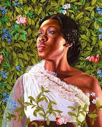
Kenhinde Wiley:
Kehinde Wiley is a contemporary African-American painter known for his distinctive portraits. His models are often young black men and women, rendered in a Photorealist style against patterned backgrounds. Kehinde is best known for his naturalistic portraits of African American men in heroic poses. ... Over the course of his career, the size of Wiley's canvases have expanded, and he began depicting his subjects, young black models or music icons, in heroic defeat as well as triumph.

|
|

|
Irene Sheri:
Irene Sheri came into the world a painter. She had a natural eye and a life long passion was certain. Her professional journey began as a young artist and won a "young artist of the year" award. She then got the highest level grade at Saint Petersburg Art school. She now has been fostering and protecting the most scared elements of fine art almost 300 years old.
|
|
|
My response:
To do this response i found a photograph/painting that i liked from the renaissance period. I think to a photograph in class as similar as i could. Although i found getting the gloomy dark lighting quite difficult i used the same props and angles as the one in the painting. I then edited it on photoshop to look more like Kehinde Wiley's photography pieces by finding a bright colourful background and then editing it into the background of my photograpgh.

|

|
www: good positioning of the model and good lighting, also perfect props for the photo/ painting i was re creating.
ebi: more refined cutting out of the background and better lighting of the photograph to get a more exact replicate of the original photograph.
ebi: more refined cutting out of the background and better lighting of the photograph to get a more exact replicate of the original photograph.
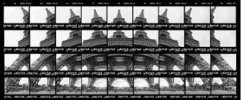
Thomas Kellner:

|

|
Thomas Kellner is a German fine-art photographer, lecturer and curator. He became known above all for his large-format photographs of famous architectural monuments, he shifted his camera movement to create a more interesting and unique finished look. Many describe his work as photo mosaics.
My response:

|

|
My images and editing:

(This photograph was taken in Muswell Hill broadway)

|

|
www: good lighting on the photo and good editing
ebi: when taking the onto to get close to the church so that when I crop it then it won't be as blurry.
ebi: when taking the onto to get close to the church so that when I crop it then it won't be as blurry.
Patrick cornillet:
|
|
Patrick Cornillet (1968) graduated from Ecole Pivaut in Nantes. Cornillet works with painting where the detailed realism of photography is united with brush strokes. His works investigates both issues concerning picturing and urbanity. Cornillet has several solo shows in Belgium, Copenhagen and Paris. He also has participated in several group exhibitions.
Cornillet has won several awards e.g. Fondation François Schneider's talent prize in the category painting in 2013. He is also represented in various collections at Lefranc-Bourgeois; Le Mans Banque Populaire, Nantes and the Collection ville de Saint-Grégoire.
Cornillet has won several awards e.g. Fondation François Schneider's talent prize in the category painting in 2013. He is also represented in various collections at Lefranc-Bourgeois; Le Mans Banque Populaire, Nantes and the Collection ville de Saint-Grégoire.
My response:

|

|
www: good clean lines when cutting out the section of the photo i wanted to remove on photoshop.
ebi: on the photo on the right the emote cut out just looks like the sky. so maybe a clean cut out on the bottom. (although i tried and found it difficult to be able to get clean and precise lines like the other cut outs i did).
ebi: on the photo on the right the emote cut out just looks like the sky. so maybe a clean cut out on the bottom. (although i tried and found it difficult to be able to get clean and precise lines like the other cut outs i did).
Second response:

www: good lighting on the photo.
ebi: taken the photo so that when editing the photo the bottom would look better (I tried to edit it but It didn't work).
ebi: taken the photo so that when editing the photo the bottom would look better (I tried to edit it but It didn't work).
Fragments of buildings:
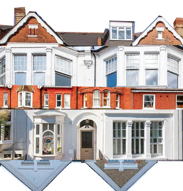
|
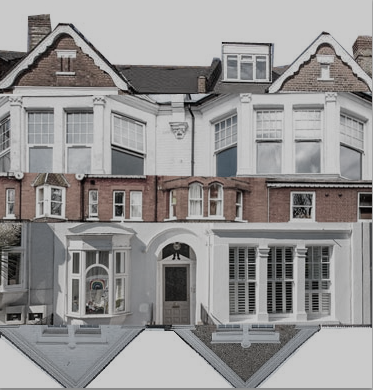
|
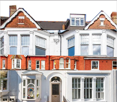
|
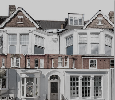
|
In this response we were given a selection of houses near where we live and we had to merge and cut out all of the different photographs. We did this on photoshop.
www: good clean cuts of each individual house.
ebi: if i would've used a more variety of different coloured house to make the different between the cut outs more defined.
www: good clean cuts of each individual house.
ebi: if i would've used a more variety of different coloured house to make the different between the cut outs more defined.
3 Strands:
1. Alan Stock- market photography:
This strand of Alan Stocks work was in Laos. The market is for the locals and tourists and the reason he chose to photograph this market was because it has a selection of what some cultures would deem as strange foods. He also liked the fact that the fact that through the photos you could tell that the market was noisy, vibrant and full of life!

|

|

|

|
The reason I chose to response to Alan Stock is because it contracts a lot to my other strands. The colourfulness of markets creates a happy feeling and it wold be a great response, I will be able to go to lots of different markets and stools; flowers, food, cheese.
1st response:

|

|

|
www: good lighting and a variety of different areas in the place these photographs were taken (Muswell Hill Cheese Shop).
ebi: if i could've rotated the photographs in the slideshow.
ebi: if i could've rotated the photographs in the slideshow.
2nd response:

|

|
These are my best photos of my seconds response! I have edited them a little by turning up the brightness, saturation and contrast a little!!
I think the location of the photos hoot was good, but i think if i had don more responses in different places i could'v had a better development and have a more accurate response to Alan Stock (my inspiration artist).
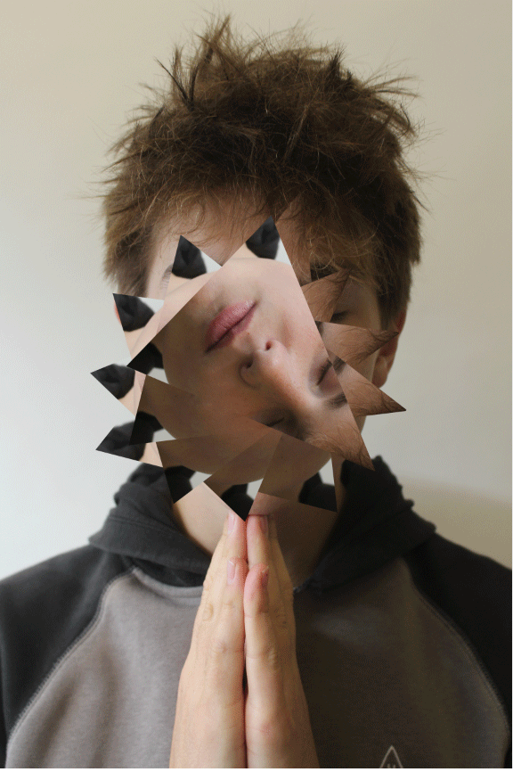
The Two sides to mental health: strand 2

|

|
|

|
In this response I want to show that there are two sides to metal health and the emotions and expressions that come across from a person at first glance are not always what reflects how people are feeling and in reality there is often a different side to every story.
my response:


|


|
www: good editing on photoshop to crop different parts of the faces onto the background photograph.
ebi: could've used flash on the white background photographs to getting a brighter background.
ebi: could've used flash on the white background photographs to getting a brighter background.
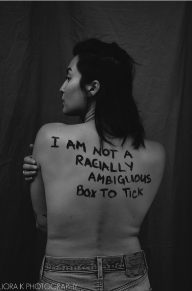
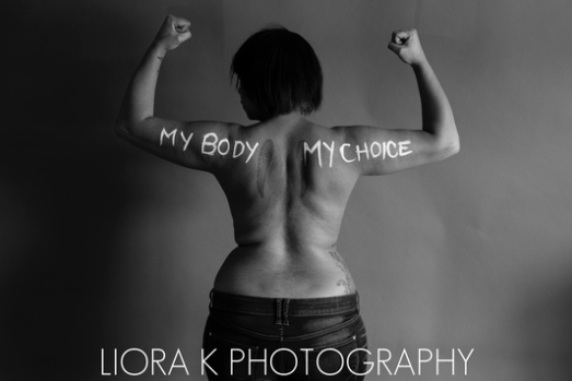
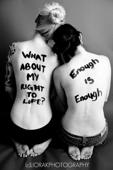
Strand 3:Liora K
Liora K is an American photographer. She did a strand called feminist photography, she wanted to amplify these women stories directly from their bodies. She focuses on the damage of the idea of the male gaze and how it has impacted todays society and not just for grown women but also for young girls and teenagers (as myself).
|
|
The reason i decided to do this strand of work is because society has this idea that its okay to comment on what peoples (especially womens) bodies look like. Natural and essential things are called provocative or distracting, this is often called out at school or in the workplace, and women find it very hard to love themselves and not compare themselves to others. So the reason i wanted to put my own twist on this strand is to understand and grasp how damaging these things can be.
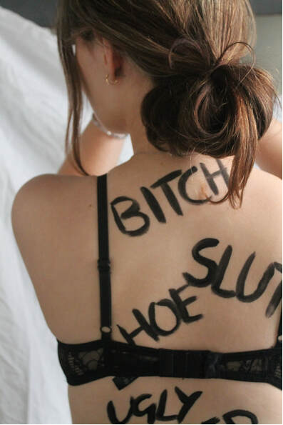
My response:


|


|


|


|

|

|
www: good lighting and angles. Aldo was able to put the message across clearly by using the contrasting colours of the writing.
ebi: if the writing on the first model was less smudged and in a few of the photos you can see the white background prop.
ebi: if the writing on the first model was less smudged and in a few of the photos you can see the white background prop.
edited photos:


|


|

|
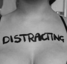
|
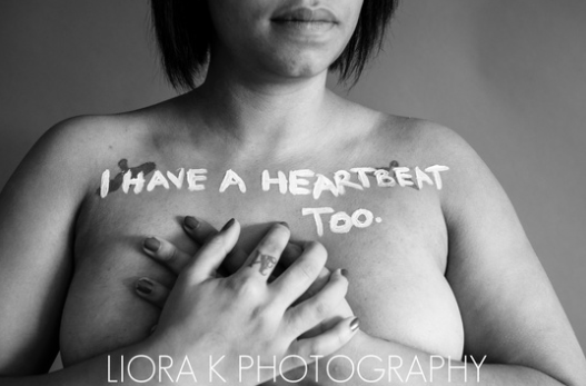
To do this shoot I took photos of my friends bodies that are usually considered "inappropriate" or "provocative" and I painted words that are thought to be acceptable on their body on certain parts of their body that are often described these ways.
www: good use of lighting and other textures using the dark paint.
ebi: could've taken some more pictures at different angles.
ebi: could've taken some more pictures at different angles.
Development 1:
In this development, I have decided to follow the theme of expression and perception of people. I decided to show the reality of how people feel rather than how they perceive themselves. I then decided to put the photos in black and white, I think that it further improved the photographs due to the added contrast of the dark back ground, it makes the hands on their faces more visible and effective.


|


|
www: good angles and lighting as well as this good idea to change to black and white to show the contrast between the colour photos and black and white.
ebi: more examples of the different facial expressions/distortions.
ebi: more examples of the different facial expressions/distortions.
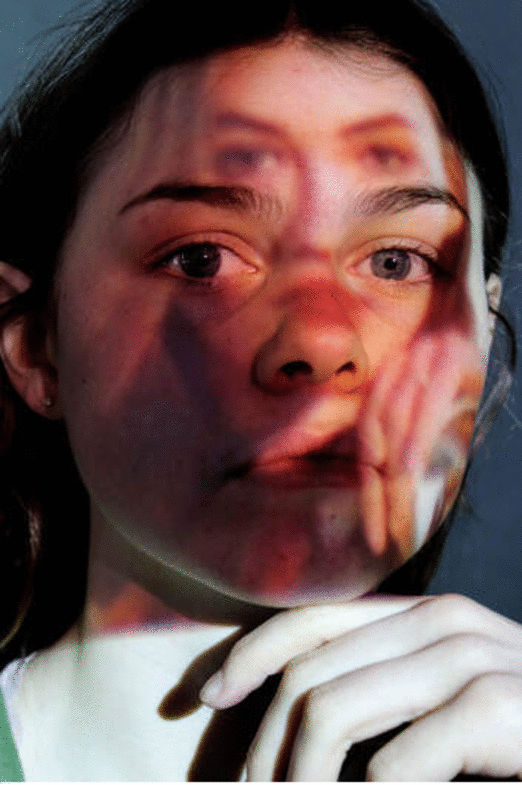
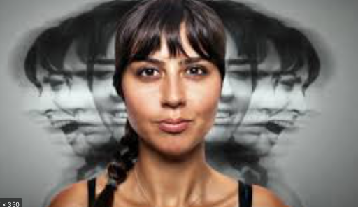
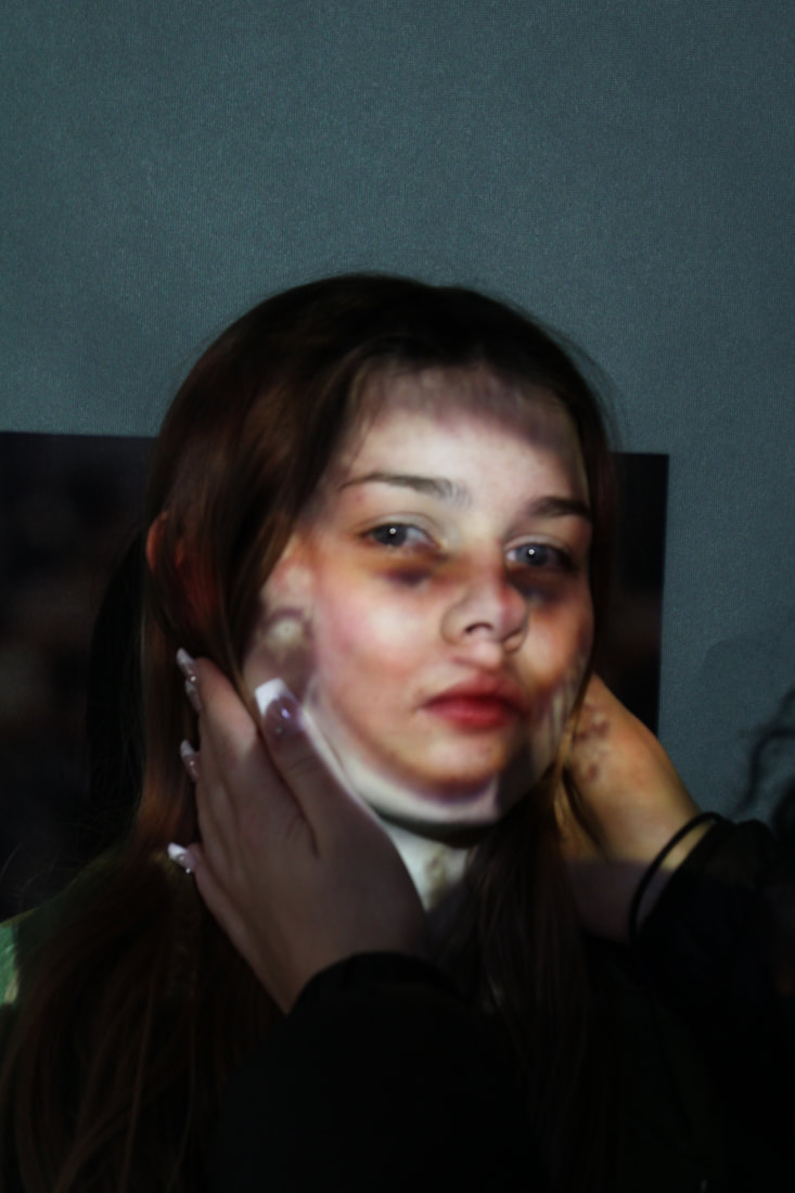
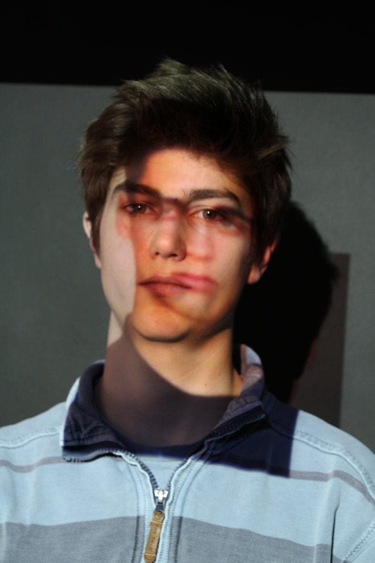
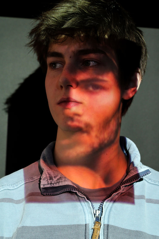
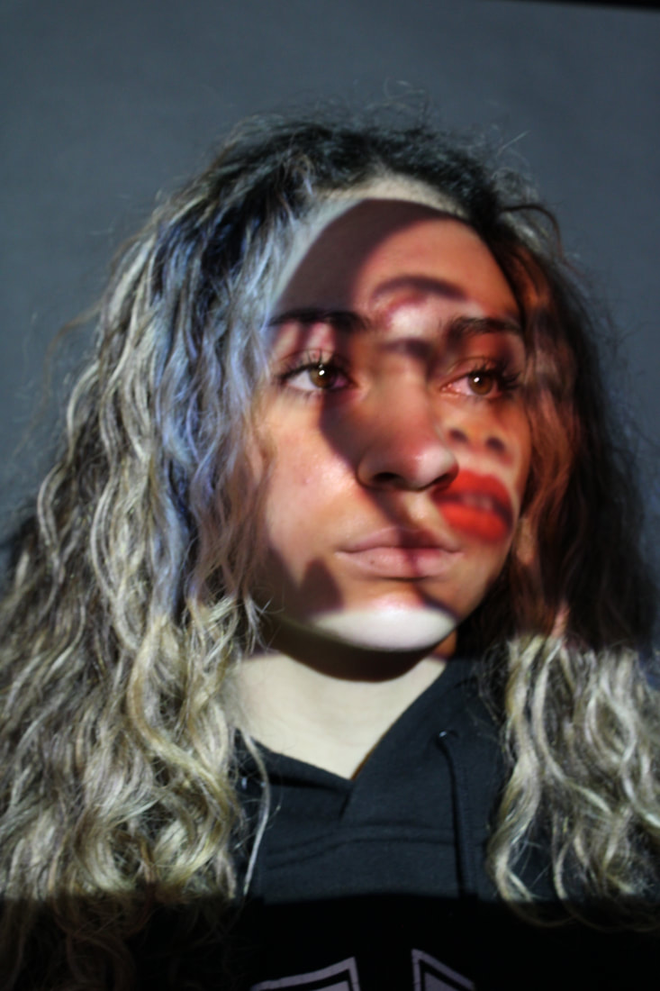
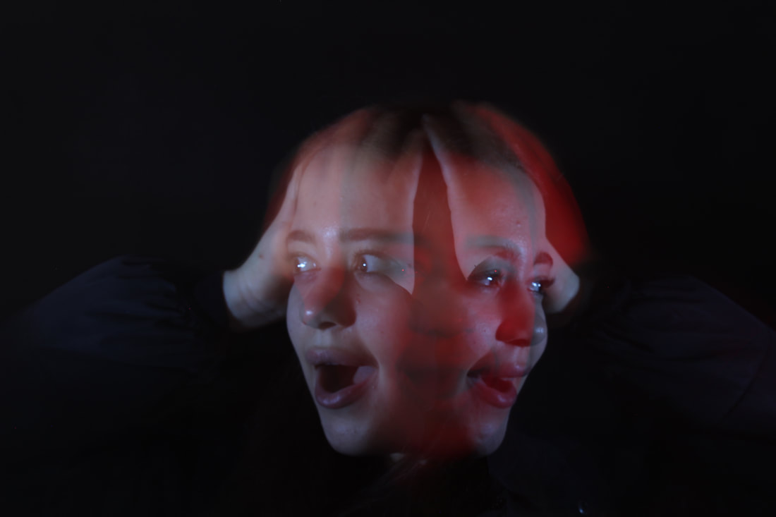
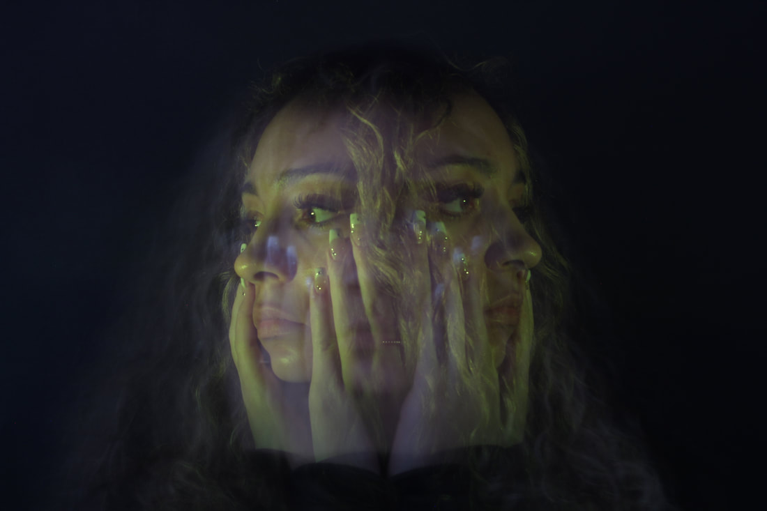
Development 2:
This is a development of my previous photographs. Its another reflection of social medias negative influence on how people perceive and think of themselves and others.
|
|


|
To do this response i selected a few images of people who are percived to be beautiful and the ideal person and reflected that onto some people in the call. I chose a series of photographs and put them onto a dock, i then projected these photographs through a whiteboard projector onto their faces to create this almost double images/face response.
www: great clear projections onto the models faces. Also great replicates of the angles of the replicated projections to be able to get the full effect of the reflections and colours clearly on their faces.
ebi: could've taken a few more photos with different models to show variety,.
ebi: could've taken a few more photos with different models to show variety,.
Edited versions:
|
|
|

|
I've edited the photos by pulling them onto photoshop, and adjusting the colours and vibrance. I wanted to make the projections too their faces more visible and also while doing so generally make the background darker.
Black and white:
|
|

|
In this photo below, I have edited all of my three best projection photos and then cropped and merged them together on photoshop to make one large/long canvas with them all joined together.
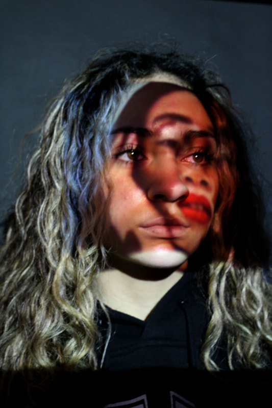
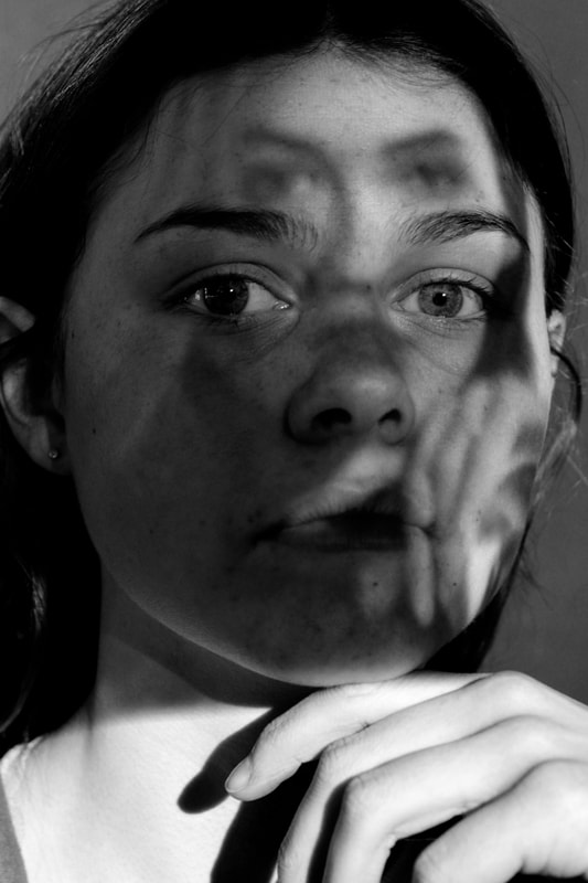
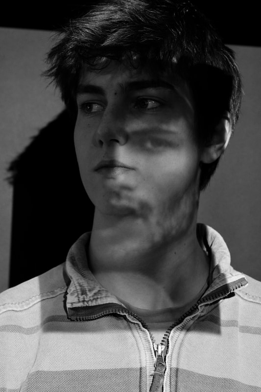
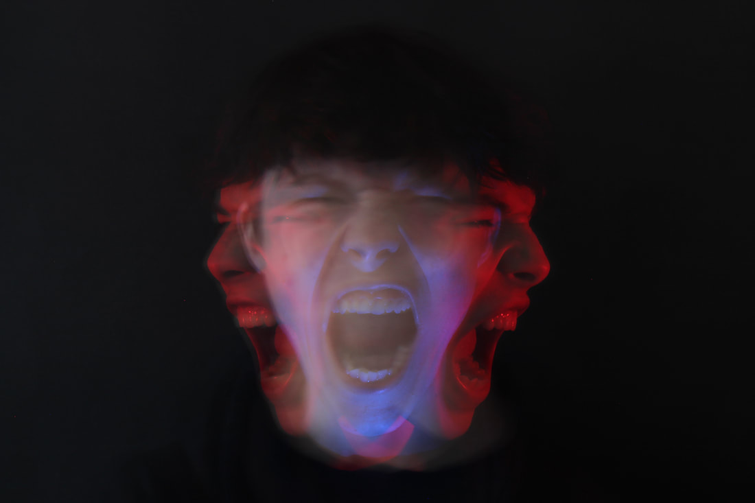
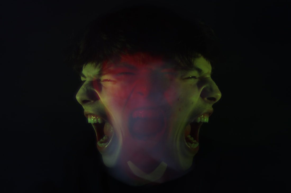
Development 3: (distorted faces)


|
|
To do this response i used a tripod for my camera to be able to maintain the same angle for each photo. The reason i needed this was as i was taking the photos i would change the colour that i chose to be projected onto the models face. I would then get them to move their face along with the colour. Therefore creating this multi angle/photo effect. As well as this to keep along the lines of my strand i asked the models to have expressions of pain or sadness to portray one again, the effects of mental health.
Triple edit:

www: good use of contrasting colours and clear images of each face every time the model moves to create the given effect.
ebi: could've taken more photos
ebi: could've taken more photos
explaining my process of development:
Throughout this process of development, from my first inspiration from Liora K, too my last. I have tried to used different concepts, whether it was colours, material used, different body party. As i developed this strand of work i have taken inspiration from various artists and used some of their ideas and style of photography to make my own. This whole development process has aimed to show the different sides of mental health and social media. And by using different representations of it i think it has created a unique and different strand of work through my idea and development process.
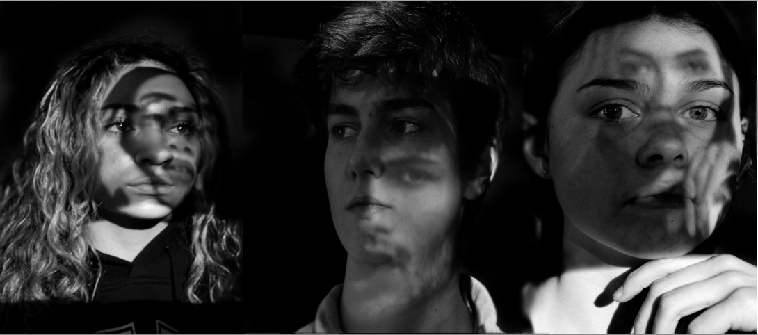
FINAL PIECE:
In regards to my final piece I have decided to choose 3 of my best/favourite photos from my most developed strand (strand 2). This whole strand mainly reflects and focuses on the effects of mental health mainly relating to social media. In the photography pieces and developments that I have done, the people in the photos are presented as how social media and society really makes them feel and also perceive themselves.

(photographs from development 3)

(photograph from development 4)
|

(photograph from development 2)
|